Berlify
initial Problem
As expats settling into Berlin, we faced many challenges navigating bureaucratic processes like obtaining tax IDs, registering addresses, and securing educational vouchers.
The official websites were confusing, requiring us to consult various sources, and we often got lost in the process. We noticed that many expats shared similar frustrations. This inspired us to understand users’ needs and explore ways to simplify these processes through UX design.
Project Details
Tools Used

Project Duration
2 weeks
Team
Two Students
Secondary Research
As an initial “competitive analysis”, We examined various applications and websites. Here are the main findings:

The most informative sources of bureaucratic procedures are not applications, they are websites.
They are not visually appealing from a UI perspective.
They are mostly link aggregates or text-heavy pages, which isn't UX-friendly.
Information is not well-organized, making it difficult to easily find what you need to address your tasks.
The information is not concise, as it contains many unnecessary articles.
They lack UX maturity in offering users assistance and guidance.
Primary Research
After establishing this foundational concept regarding the market pain points, we considered the necessity of an application with a more mature UX/UI. We formulated an initial hypothesis to first confirm this necessity.
Hypothesis: If Expats in Berlin have all the bureaucratic information regarding settling into the new country, organized within a single app and receive assistance in completing the required steps, they can go through the process of establishing themselves in the new country more effectively .
Here are the KPIs needed to be measured related to our hypothesis .
Measure of the difficulty users currently experience navigating official German websites
Measure of how much users need to consult multiple sources of information
User satisfaction ratings regarding gaining assistance in completing the steps.
Research Goals
Organization of Information
Completeness of information
Reliability of information
Assistance during the steps
Research Plan
Target group: Expats living in Berlin
Survey
28 participants
Google Forms
Interview
4 participants
Google meet

Qualitative Research Findings
Percentage of users needing to consult multiple resources to find enough information regarding each bureaucratic procedure.
92%
Degree of difficulty in navigating German websites to find information on bureaucratic procedures for users.
79%
Qualitative Research Findings
Percentage of users needing to consult multiple resources to find enough information regarding each bureaucratic procedure.
92%
Degree of difficulty in navigating German websites to find information on bureaucratic procedures for users.
79%
The factors that most influence the users to use a source of information regarding bureaucratic tasks.
63%
Clarity and comprehensiveness of information provided in one app
27%
Recommendation from friend and family
16%
Other
The type of help or support users find most lacking while trying to navigate bureaucratic processes in Germany?
58%
Better organization of information
13%
Tips and Tricks advices
13%
Checklist of necessary documents
16%
Other
Qualitative Research Findings
On the basis of the foundation we have made with survey results, we needed to delve deeper into the users’ needs and emotions regarding the four areas of our goals. We conducted interviews and analyzed the results. These findings led us to define the problem in five main sections and start ideating solutions for each.
Define+Ideation
Problem:
Finding information on bureaucratic procedures in Berlin is challenging for users because the information is :
scattered across various sources
presented as lengthy walls of text
containing unnecessary information
Solution Designing a step-by-step interactive tutorial on each bureaucratic procedure that provides users with a sense of guidance as they progress through completing each step.
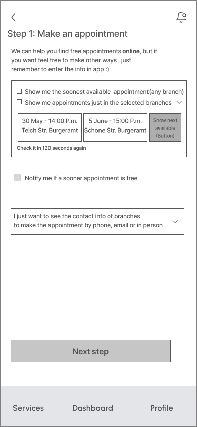
Problem Finding free appointments on official websites in Berlin is difficult. users need to regularly refresh the citizen office website to find an available one.
Solution Designing a feature to “Find and Register for free appointments” on the citizen office website.
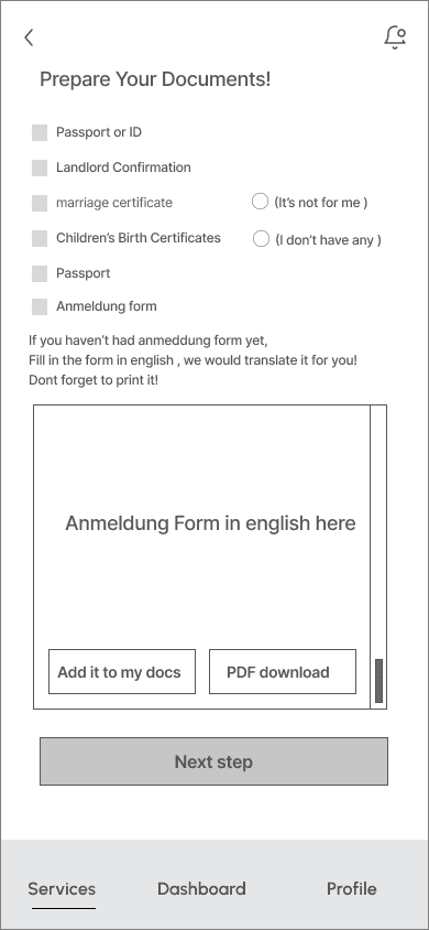
Problem The German language barrier affects expats in completing their bureaucratic procedures.
Solution Designing a "Fill in the Form" feature connected to the official site for forms that can be completed online, so that users fill them in English, It will translated to german.
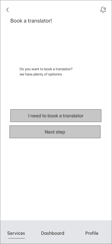
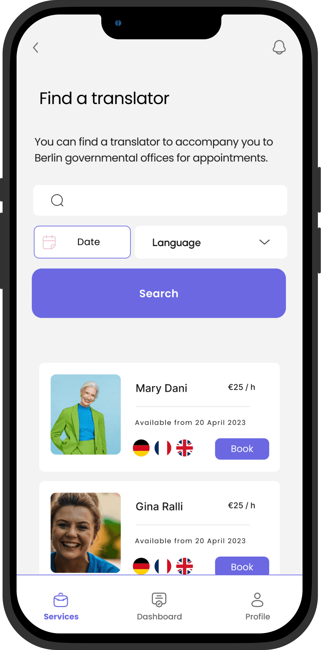
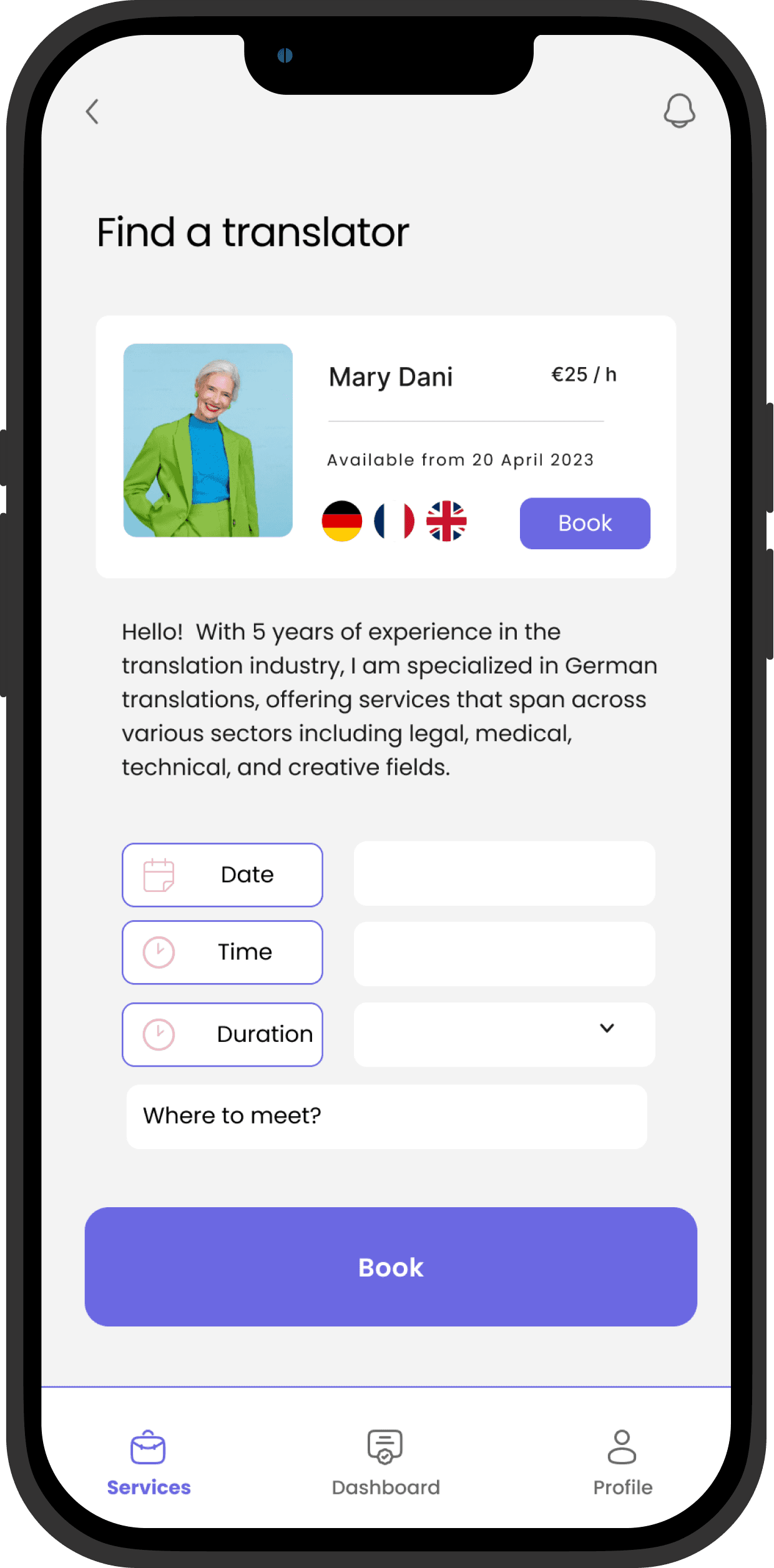
Solution Designing a "Book a Translator" feature to accompany users to their official appointments.
Problem The overall process has :
too many steps to follow
too many documents to provide
too many details to remember
Solution
Solution Designing a dashboard to keep track of processes and remind users of necessary steps .
Problem Users struggle to find a reliable source of information
Solution Users trust a source of information when they see that tutorials are updated, information is verified by experts, and it also affects their trust when they see a list of friends who follow the app based on contacts.
User Persona

Elea Paperwork

Singer- Berlin
Bureaucratic tasks Done
Time on bureaucratic tasks
German Language Level
Friends Available for help
“When I decided to move to Berlin, I had no idea I would have to navigate through so many challenges for my bureaucracy issues.!”
Pain Points
Confused about the exact steps for each bureaucratic procedure
bored of consulting multiple sources
stressed about making mistakes
Motivations
Access to Clear, accessible and organized bureaucratic information Feel that I can rely on a source of information Sense of being guided interactively through the bureaucratic tasks Sense of being reminded of details I may forget regarding procedures Sense of being supported in overcoming the German language barrier
Elea Paperwork
Singer- Berlin
Bureaucratic tasks Done
Time on bureaucratic tasks
German Language Level
Friends Available for help
“When I decided to move to Berlin, I had no idea I would have to navigate through so many challenges for my bureaucracy issues.!”
Pain Points
Confused about the exact steps for each bureaucratic procedure
bored of consulting multiple sources
stressed about making mistakes
Motivations
Access to Clear, accessible and organized bureaucratic information Feel that I can rely on a source of information Sense of being guided interactively through the bureaucratic tasks Sense of being reminded of details I may forget regarding procedures Sense of being supported in overcoming the German language barrier
Design Principles
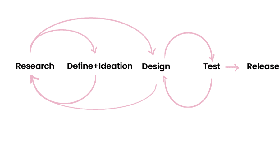
Based on our research findings, we established our principles on these three pillars:
Organization
Clearness
Support
We had a mentoring session with a web developer to determine the feasibility of the features we had considered. Here are the results:
"Fill in the Form” Feature (connected to official site).
Technically, it is feasible. However, due to challenges, it may not be logistically viable considering business issues. [It could be implemented with a robot, but the official website may restrict the robot's access due to security concerns, thus requiring constant further developments.]
Alternatively, we could offer a "Form Translator Feature". Users fill out the forms in English, which will then be translated to German but not uploaded to the official website. They can print the form for in-person submission and save it as a PDF for online submissions."
Register for free appointments" Feature.
Technically, it is feasible. However, but due to similar reasons as the previous challenges, we did not consider it.
Alternatively, we could offer a feature to simply "Find" free appointments and send notifications to the user so that they can register them on the official websites.
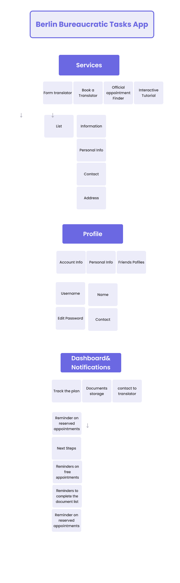
Information Architecture
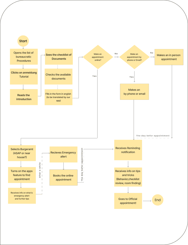
User Flow
Style Guide Decisions
on the basis of our design principles we founded our style guide decisions, We wanted to achieve a feeling of seriousness, but also wanted the app to feel motivating and be a little playful as well.

Organization
Clearness
A Minimal design
Color coding for each procedure
Clear yet mild and curvey Font
Support
A fun and gender-neutral character to accompany users throughout the whole process!
A vibrant color palette resembling joy serves as an emotional support to reduce users' stress and boredom.
Colors
Concept Colors
Color1
#F7DA73
Color2
#DCC1FF
Color3
#EBB4C8
Color4
#F7DA73
Color5
#DCC1FF
Primary
#EBB4C8
Status Colors
Success
#F48C13
Error
#F48C13
Warning
#F48C13
Text Colors
Color 1
#F48C13
Color 2
#6E6E6F
Font
For our app, we chose a very graceful yet readable font, something that combines clarity and simplicity but with a touch of freshness: Poppins.
Poppins Font - SemiBold - 25
Poppins Font - Regular -18
Poppins Font -Medium - 14

Wireframes
“Register a Place” Tutorial

Book a Translator
Dashboard and Profile

Wireframes
“Register a Place” Tutorial
Book a Translator
Dashboard and Profile
Usability Test
After designing the first version of Hi-Fi franes,We tested them with three potential users and found some common patterns. We applied changes based on the test results.Also, on some pages some ux copy was too much, needed to be reduced.Here are some of the applied changes.
Before
After
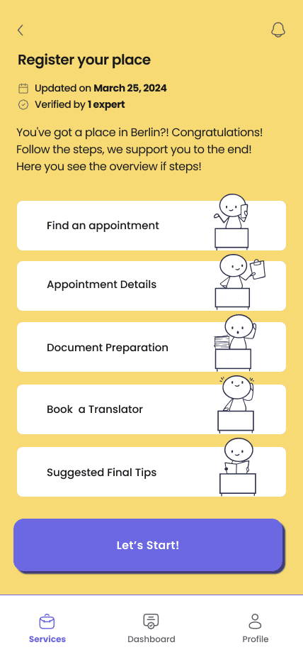
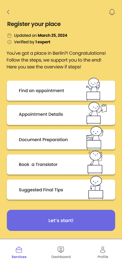
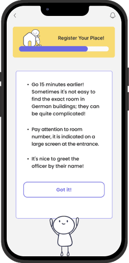
On the first page of the "Register Your Place" tutorial, an overview of the steps is provided. They were confusing for users, as they thought these were buttons. Therefore, the shadows were removed, and the action button was designed to be more prominent.
Before
After
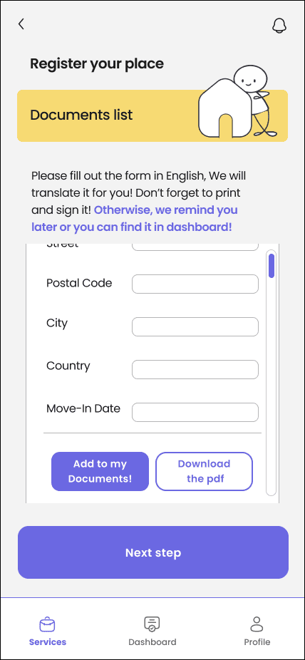
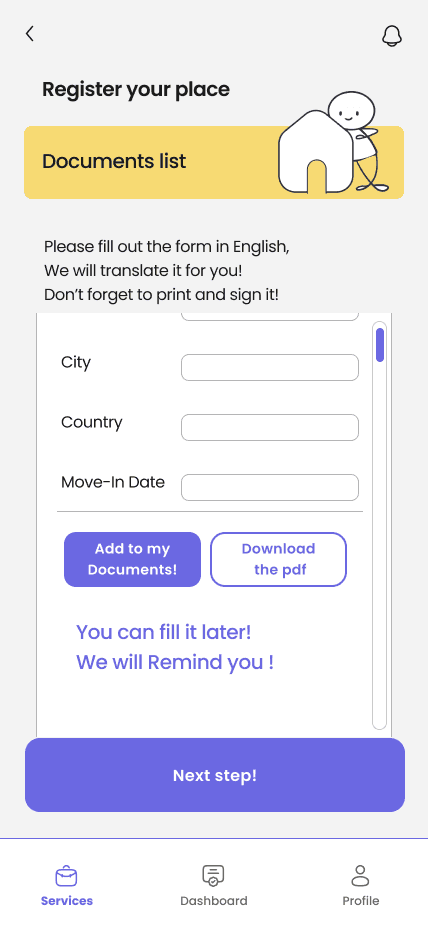
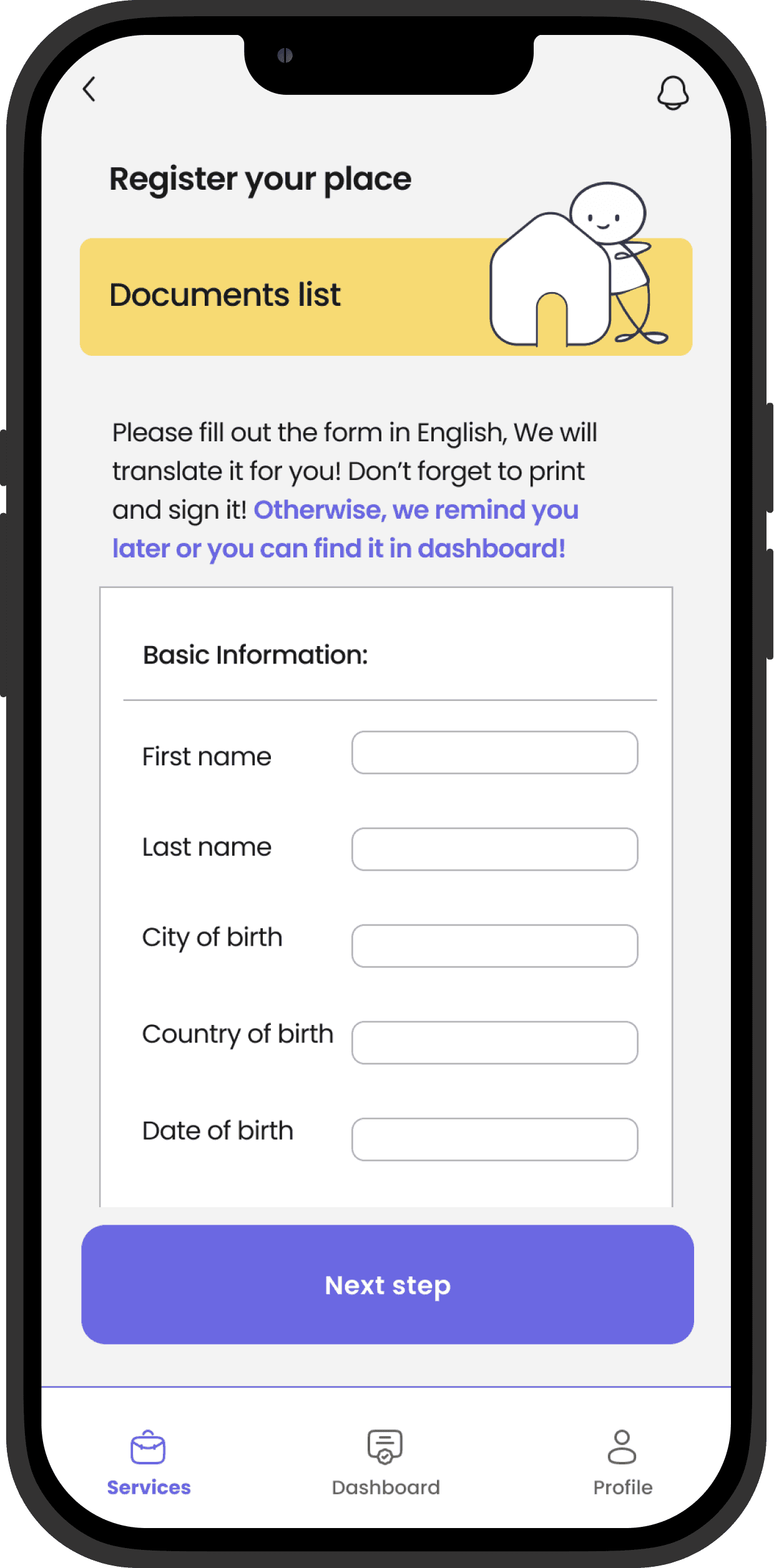
During the "Register Your Place" process, there is a form to be filled out in English and translated into German. It can be completed later, and the app will remind the user if they forget. This information, indicating that the form can be filled out later, was written at the end of the scroll. It needed to be more prominently displayed on the page.
Before

After
Final Hi-Fi Prototype
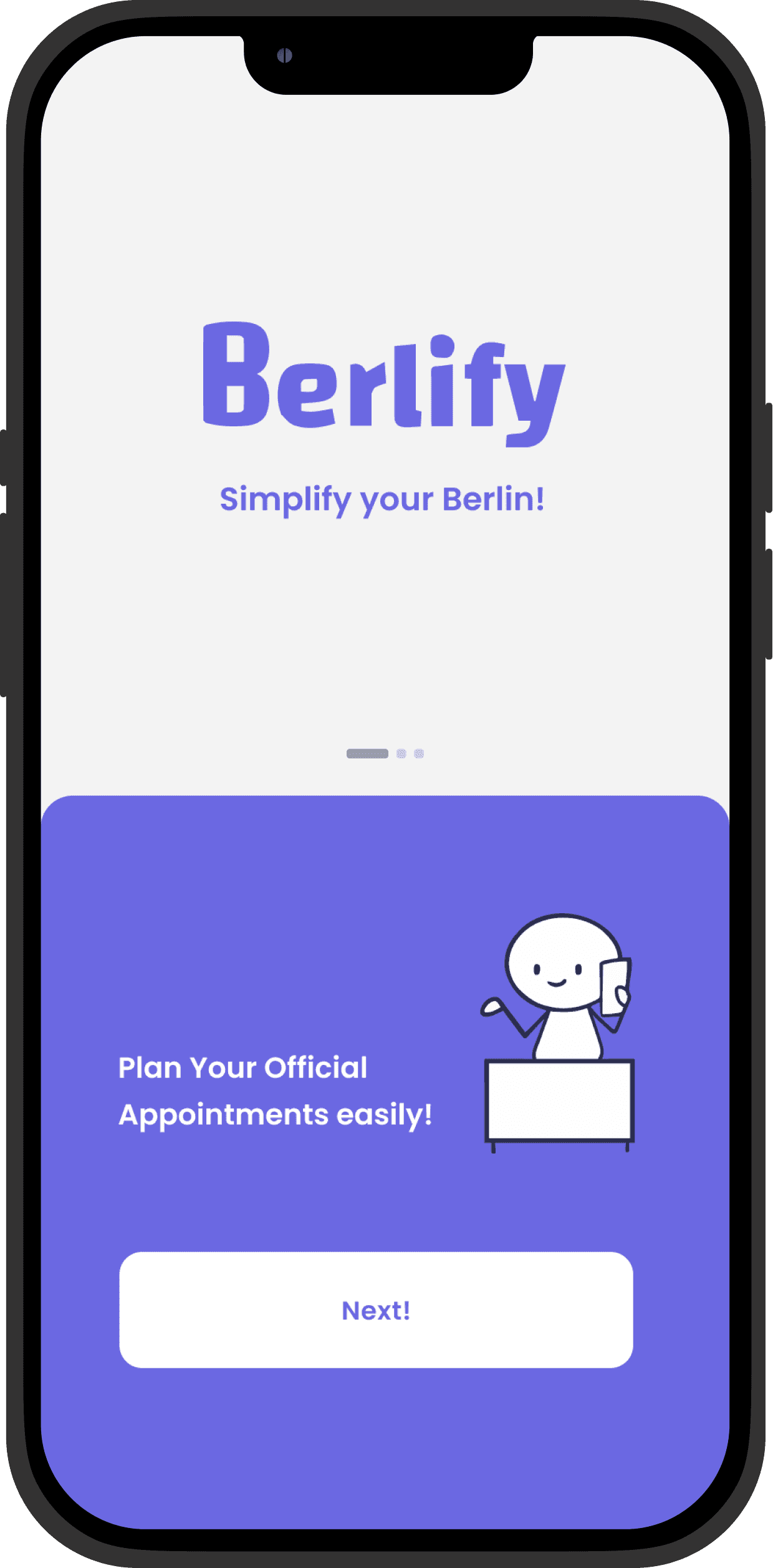
Splash Screens
From the start, we wanted to give the user a sense of having someone to accompany them during the process by adding this gender-neutral character.


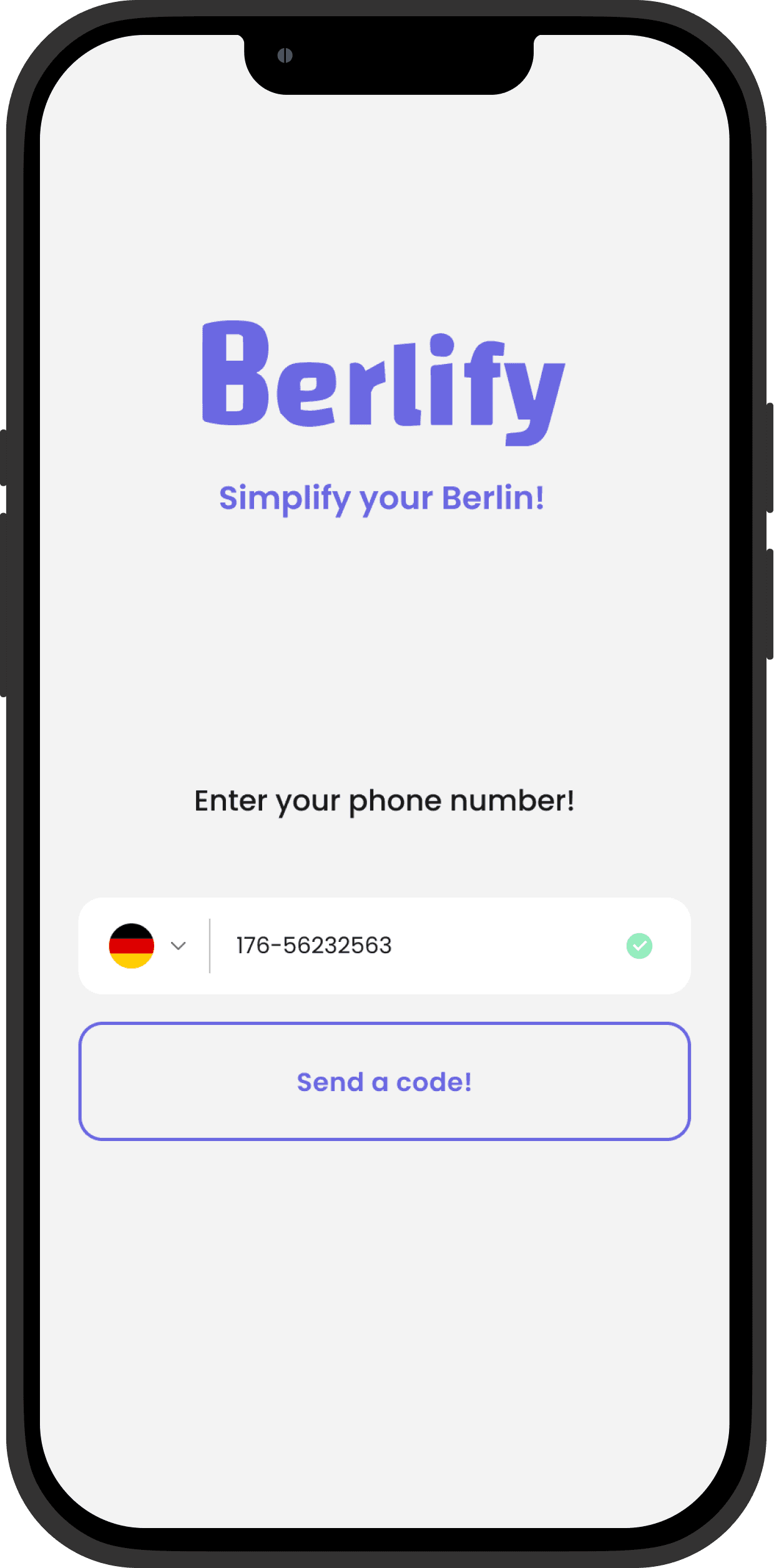
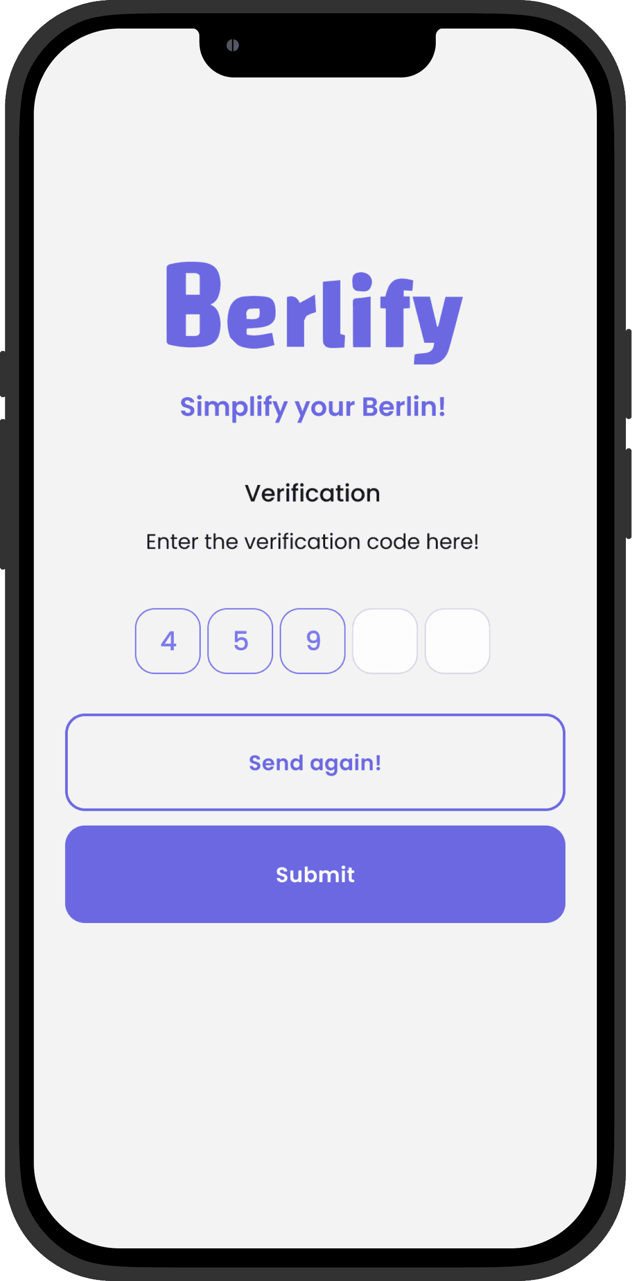
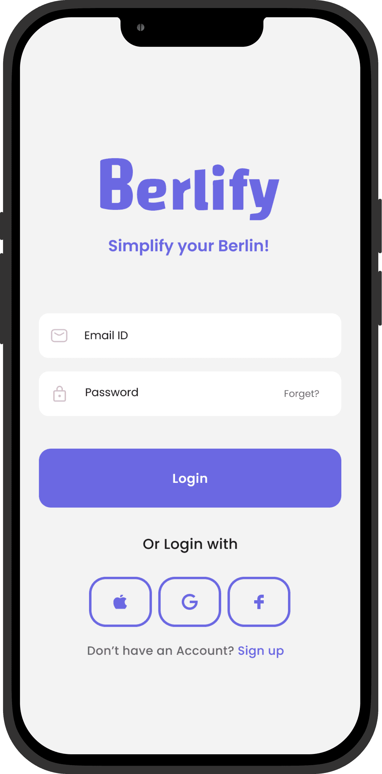
Login
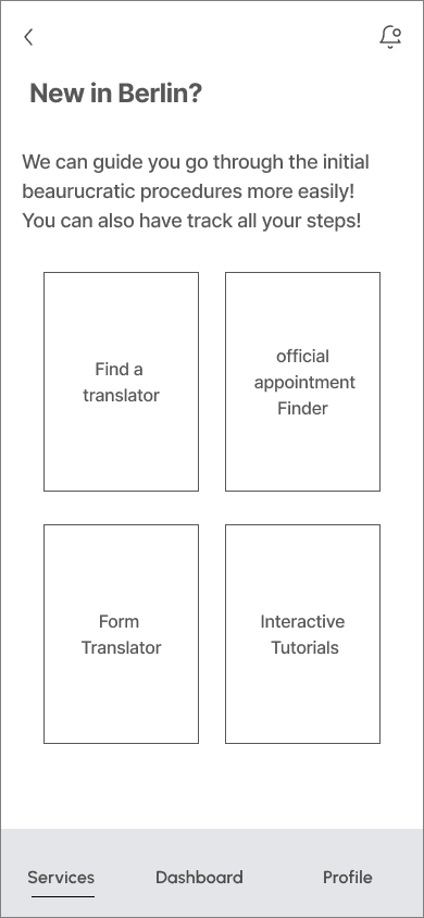
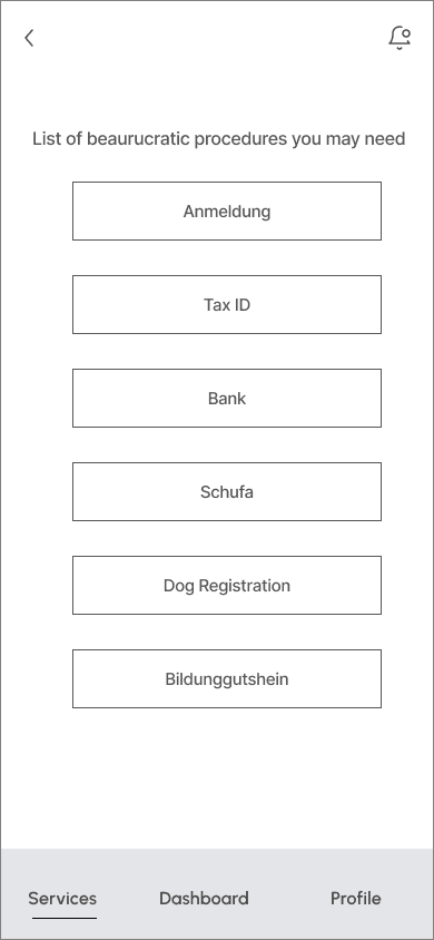
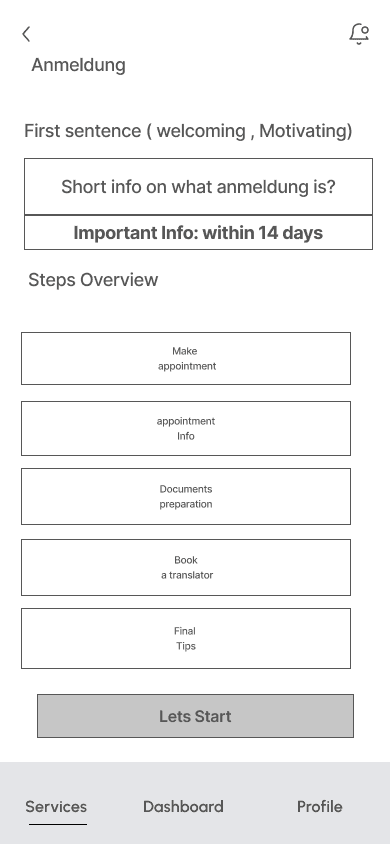
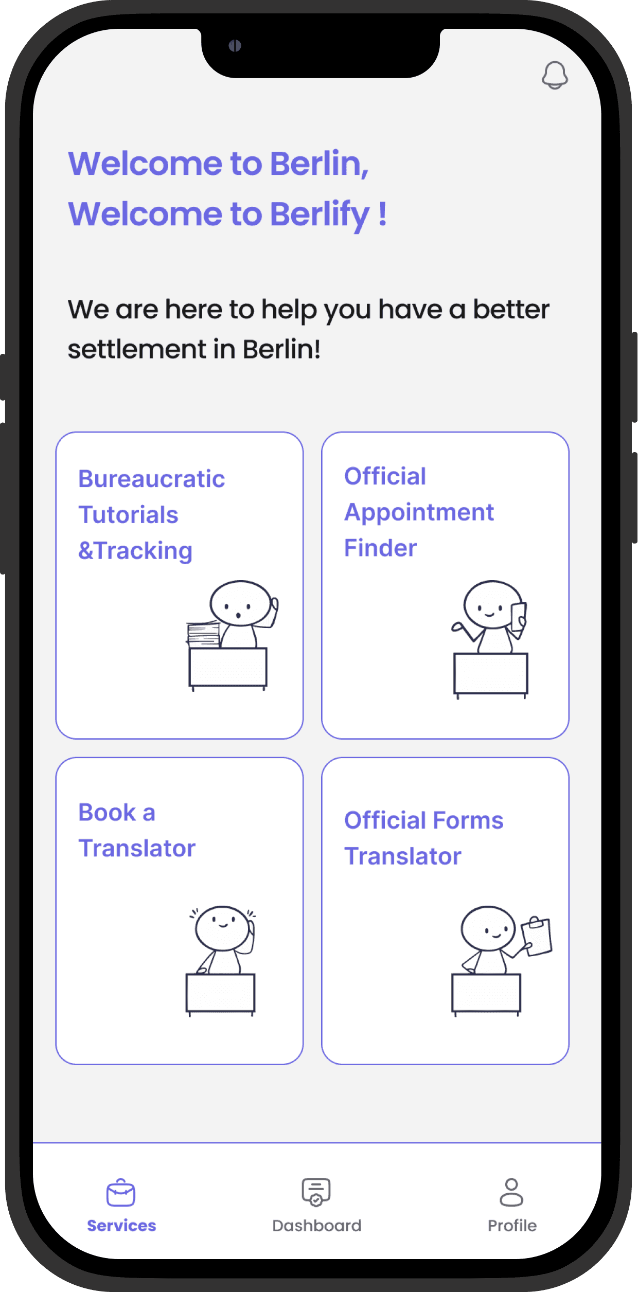
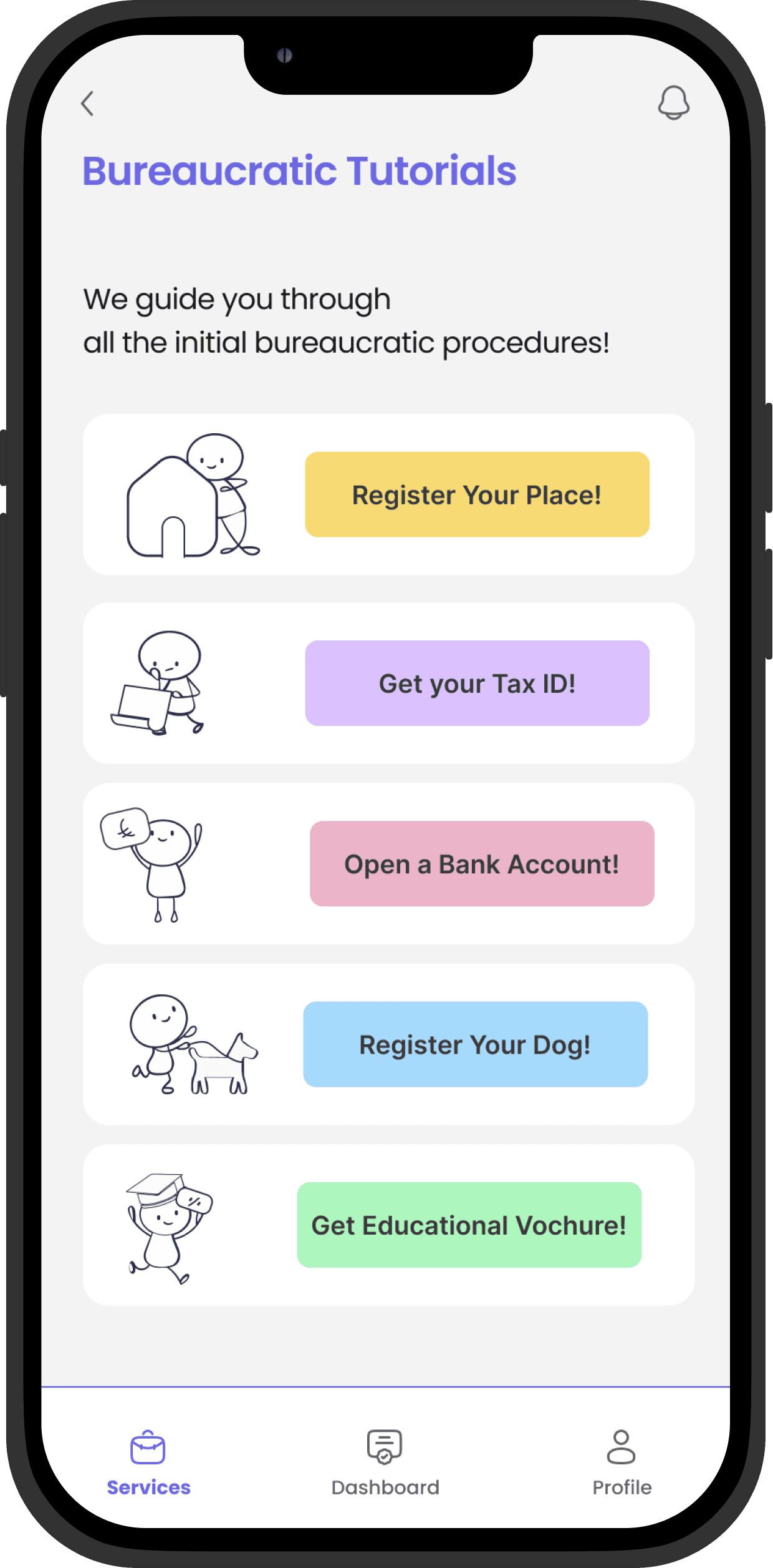
Based on our research, here are the main services our users need to access, which we have dedicated the home page to. The second page below showcases a list of bureaucratic procedure tutorials. The third page shows the steps needed to complete the process of registering a place in Berlin.
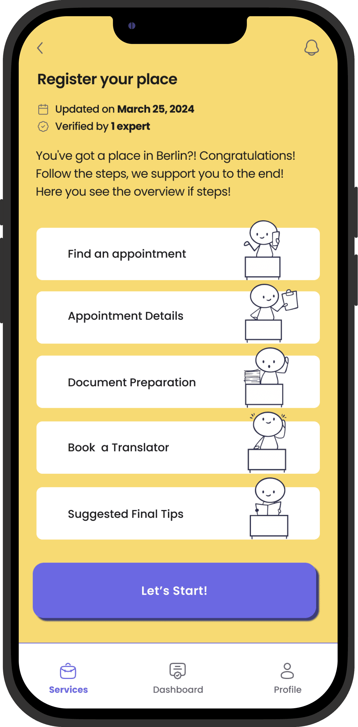
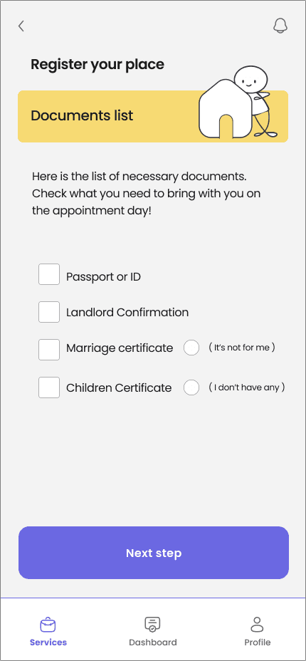
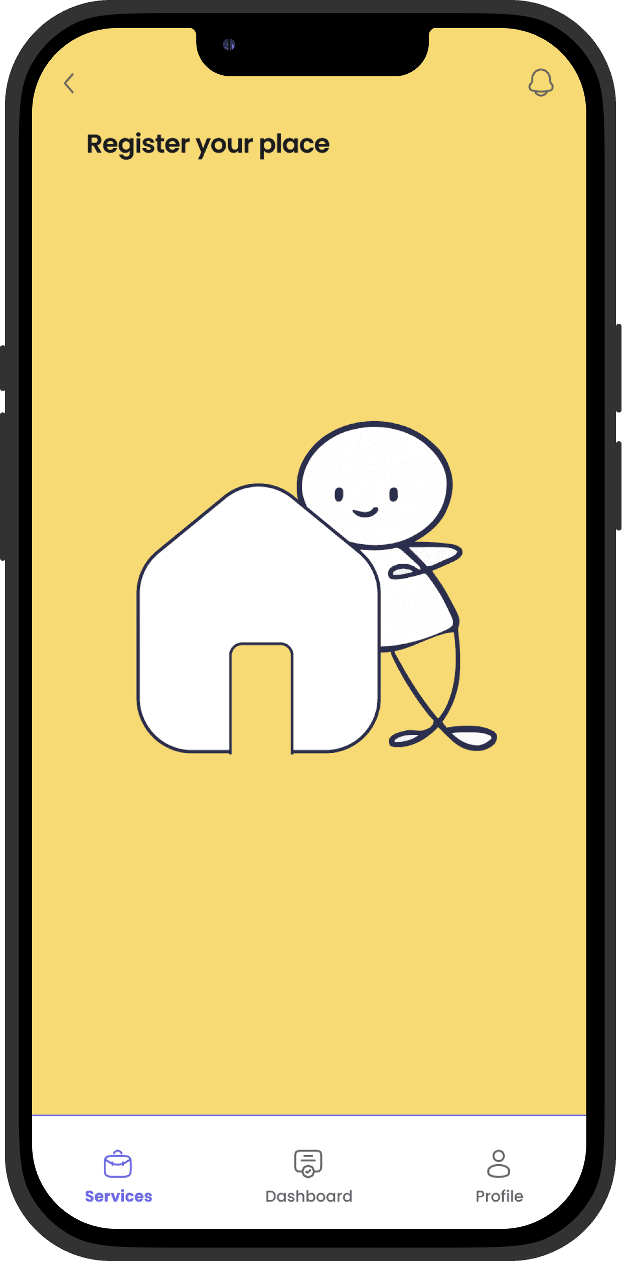
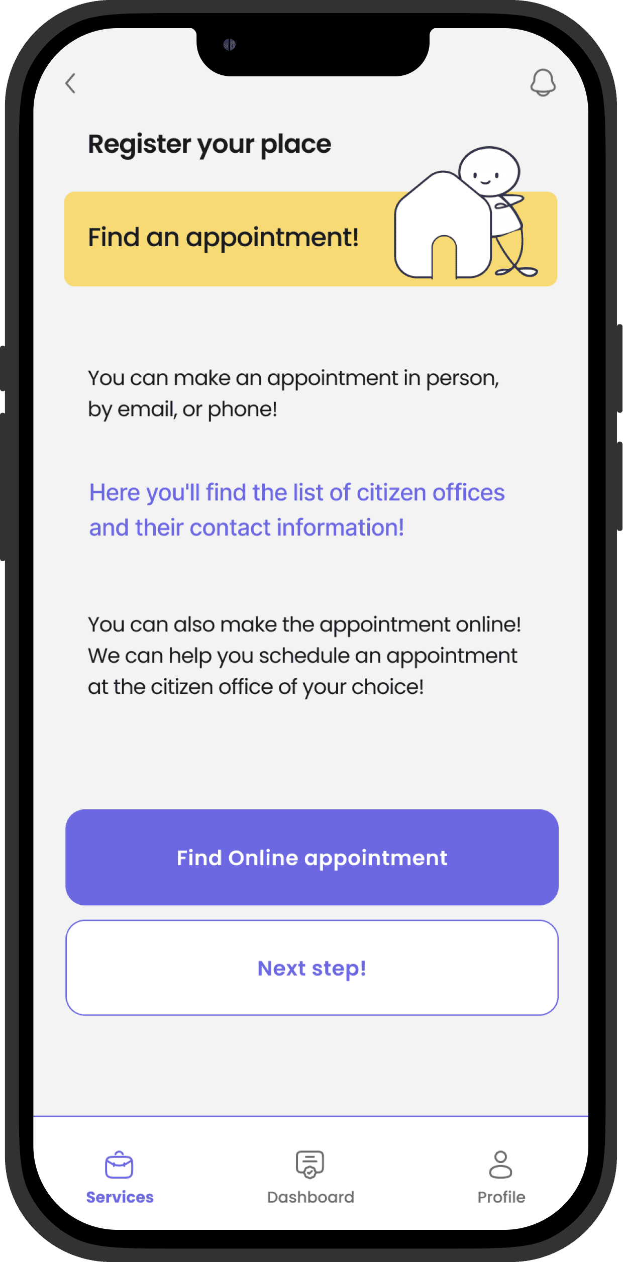
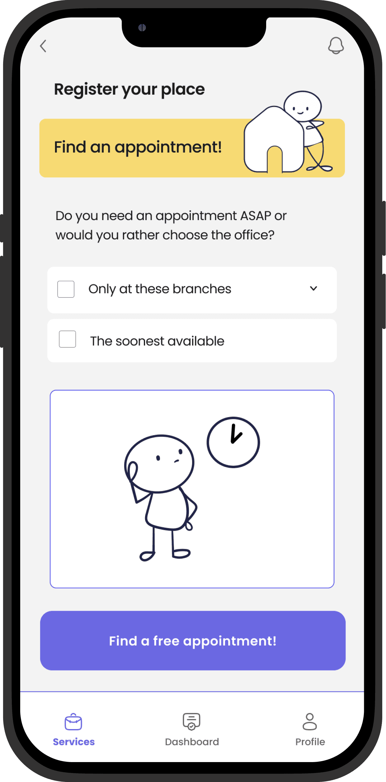
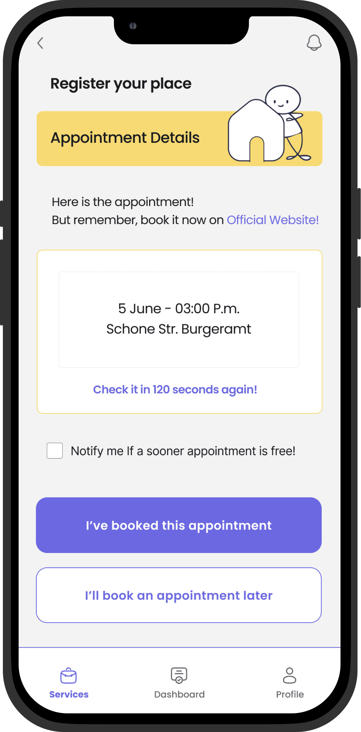
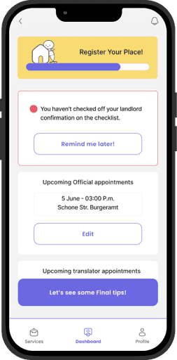
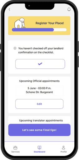
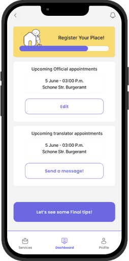
Register a Place
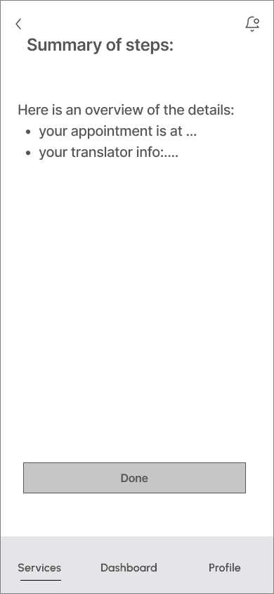
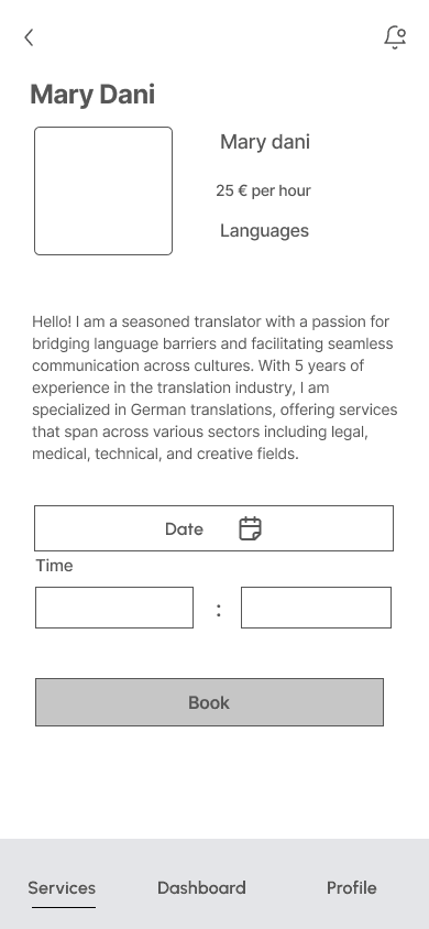
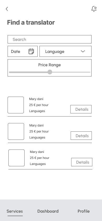
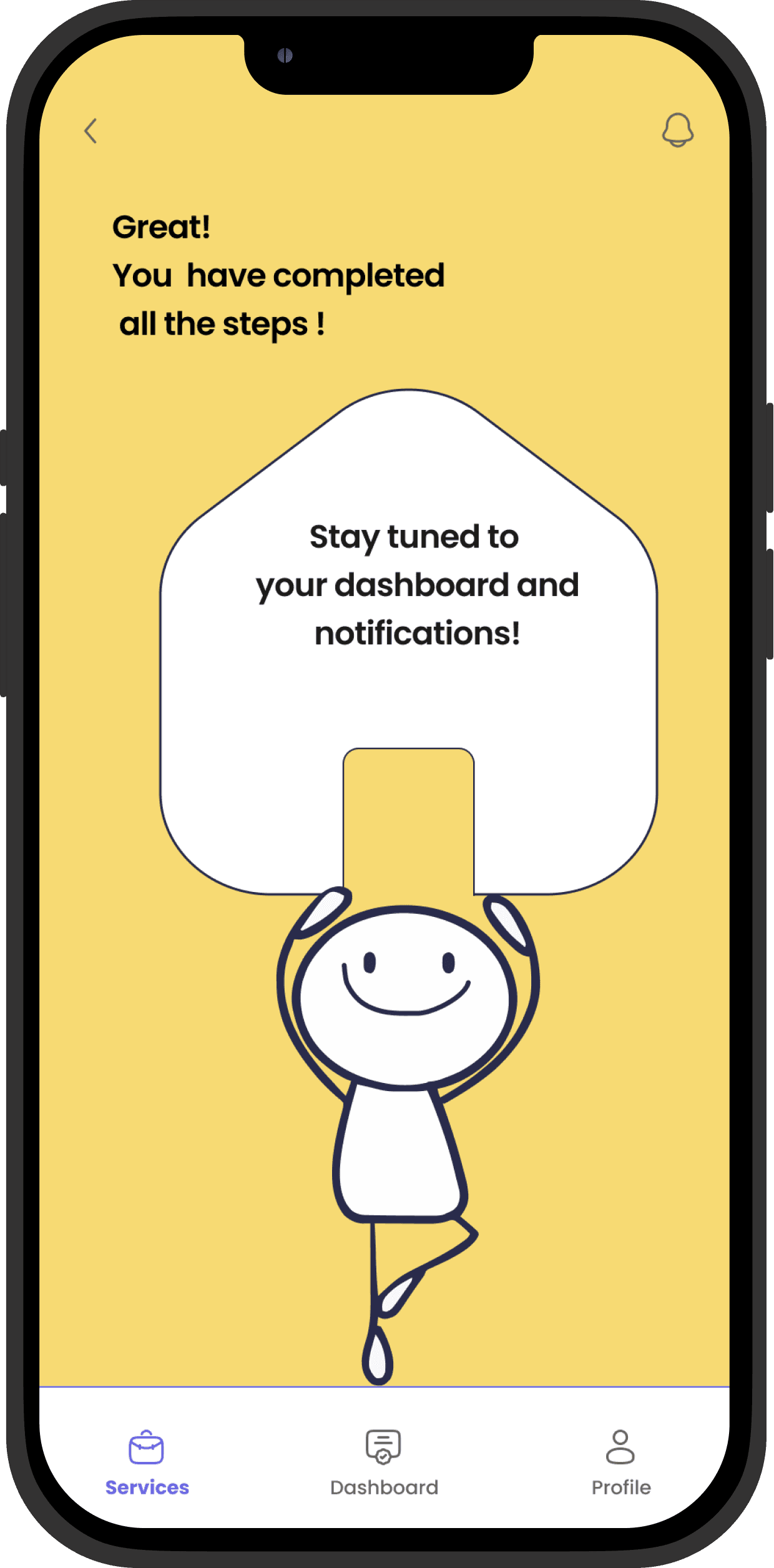
Here are the screens designed to show the steps of registering a place in Berlin, including finding an appointment, filling out the necessary forms, and booking a translator.

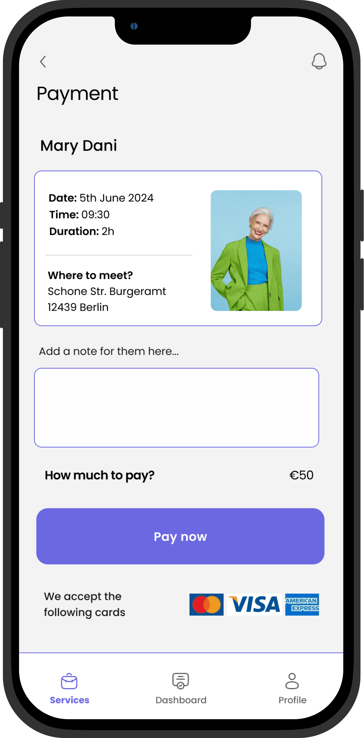
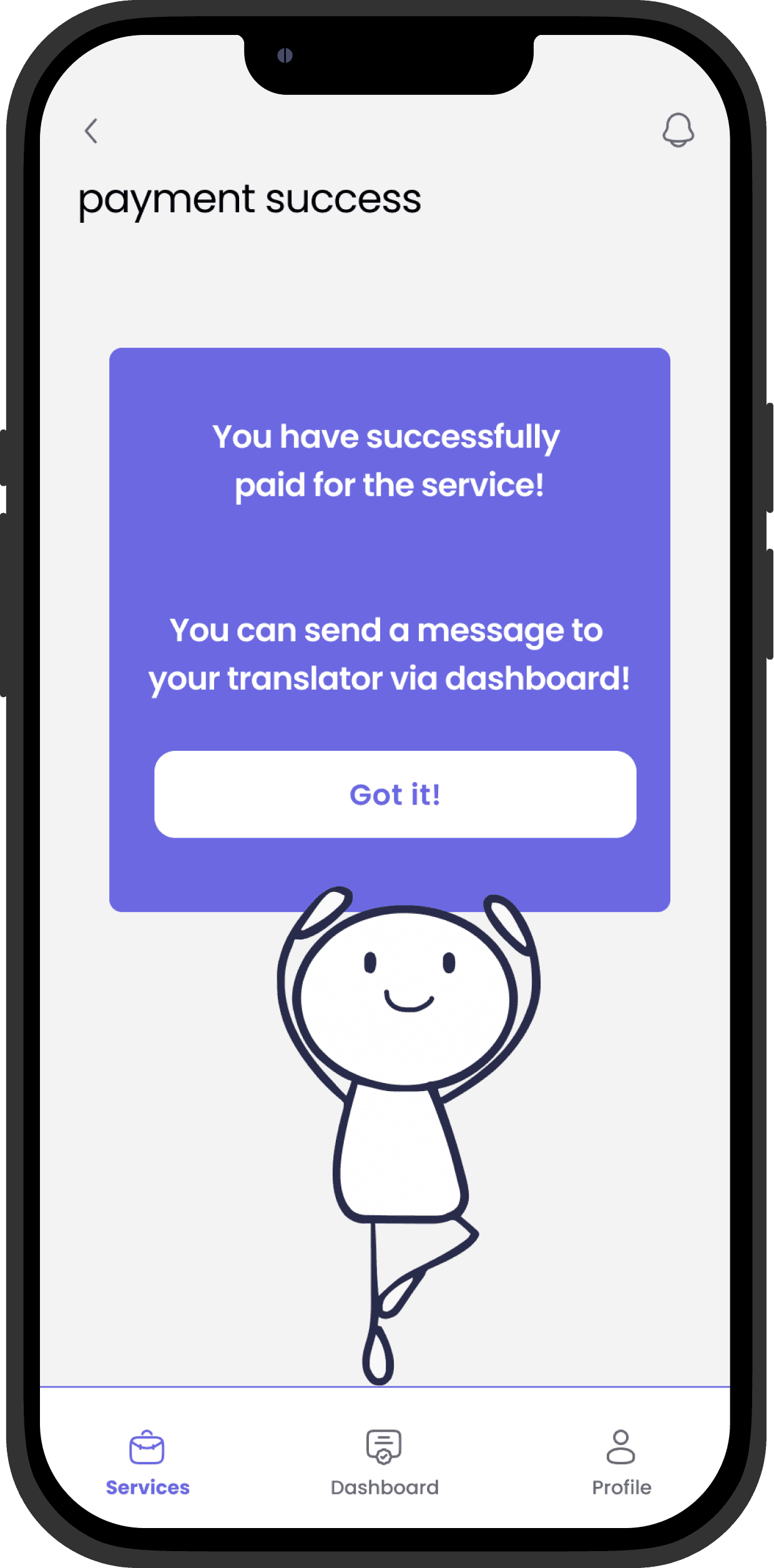
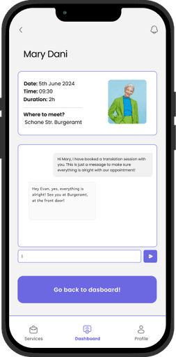
After paying for the translator, users can send a message to them via dashboard.
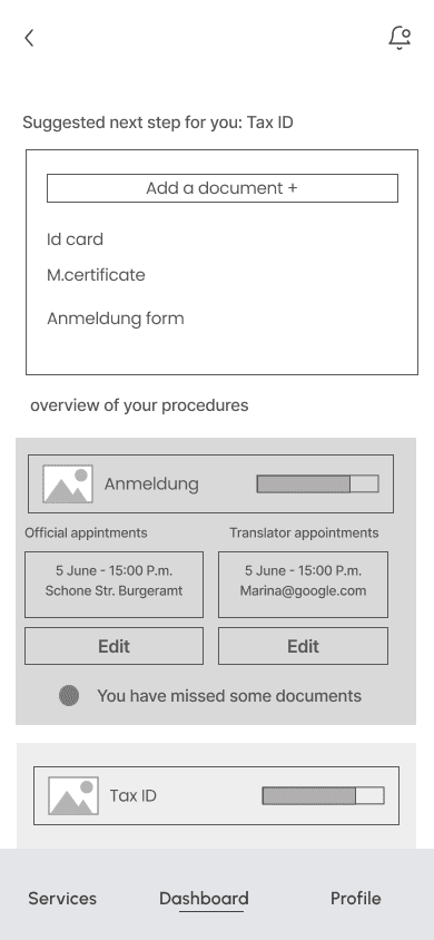
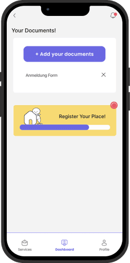
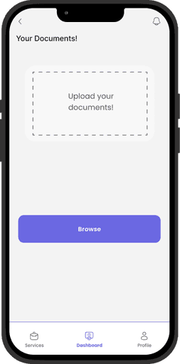
Users can add images of any necessary documents to have in their dashboard. They can also track notifications and details related to each bureaucratic procedure or chat with the Translator they have booked before.
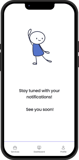
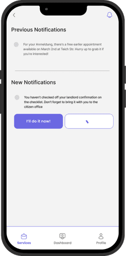
Notifications
Every new notification is accessible through the notification icon. They are organized from the most recent to the oldest.
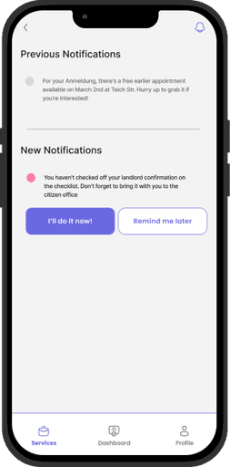
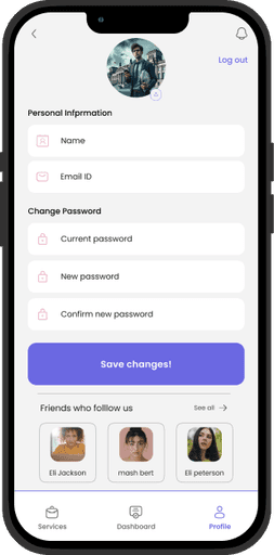
Users can edit the information on their profiles here. The list of friends who use this app is also listed as a motivation for users to trust using this app, which has been mentioned as an effective factor in the research results.